Nombolo - Hyperlocal Social App
OVERVIEW
Nombolo flips the script on performative social media.
It’s an experiential, geo-video mobile application where people share real recommendations, no “pitch deck” energy, just locals posting what they love.
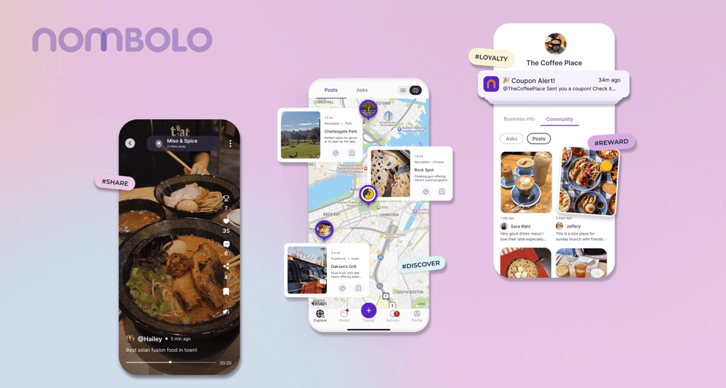
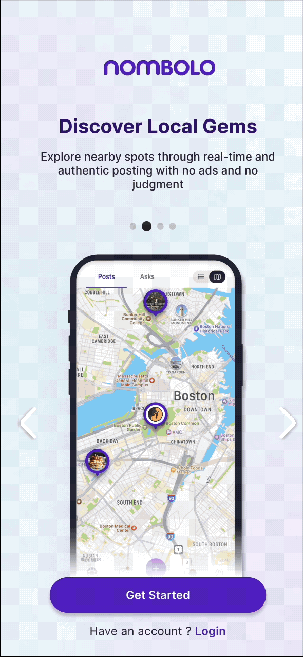
A video-first, location-based social platform for local discovery
MY ROLE
UX/UI Designer (Intern)
Mobile UX, Prototyping, Animation, Motion & Interaction
TIMELINE
May - July 2025
TEAM
Nombolo Design Team (Product, Dev, and Marketing)
My role (small team, fast cycles)
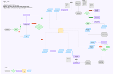
As part of a small, fast-moving product team, I joined Nombolo during its MVP2 phase to refine onboarding, re-energize the feed, and clarify the Create experience. My role blended UX/UI design, motion direction, and interaction specification for React Native implementation.
Nombolo Onboarding screen animations
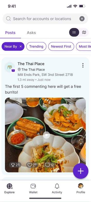
User sessions showed that most people didn’t realize feed cards were videos.
The old layout cropped video covers and lacked clear play affordances, making everything feel static.
“Why should I download this app on my phone?”
New users didn’t understand what Nombolo does or why it’s different from other social media apps in market
Video posts felt static
Cropped covers and weak affordances made videos look like images
Create flow ambiguity
“Ask” vs “Post” lived under the same button and looked the same—cognitive load, mis-taps.
Because the product was still evolving, this internship offered space to experiment — to prototype quickly, validate ideas, and ship what worked.
My approach combined three goals:
Explain the product within the product
Make the feed feel alive
Untangle the create experience
The problem we saw
What I designed (and why)
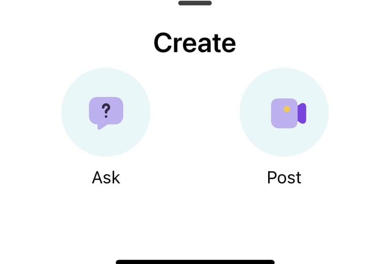
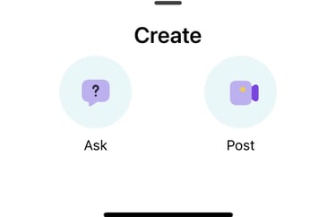
3. CLEAR "ASK" & "POST" FLOW
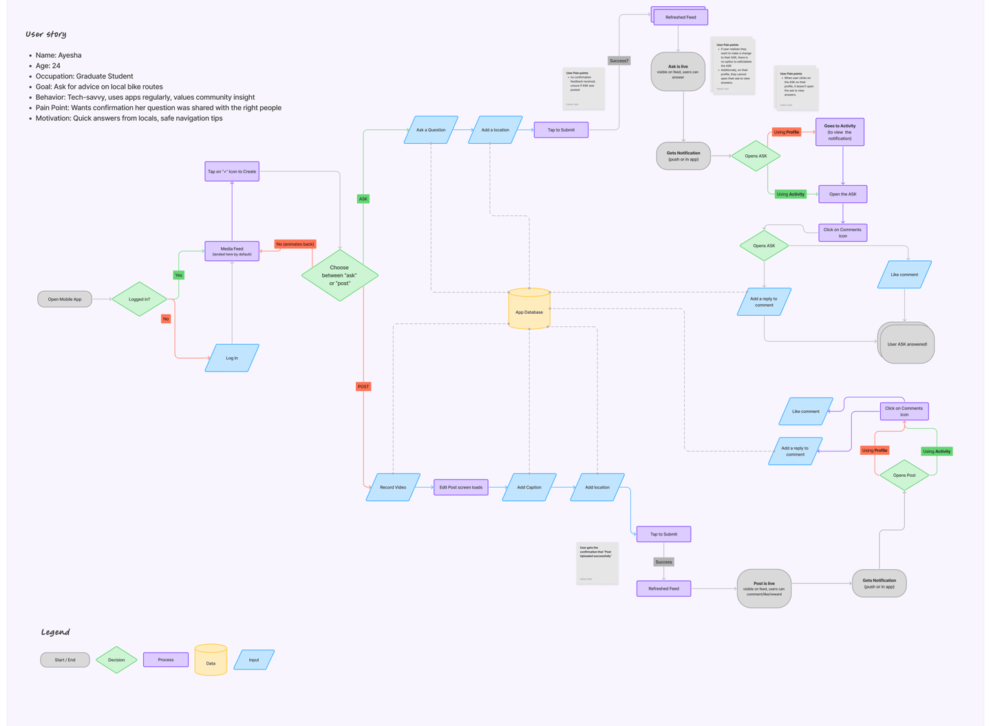
Nombolo supports two very different intents asking questions and sharing posts. In the original Create menu, they looked identical. I explored dual-path entry with distinct iconography and color tokens, and a separated flow so users commit to the right mode earlier. Fewer second guesses, fewer backtracks.
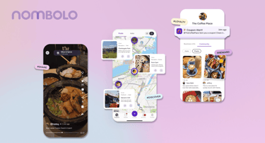
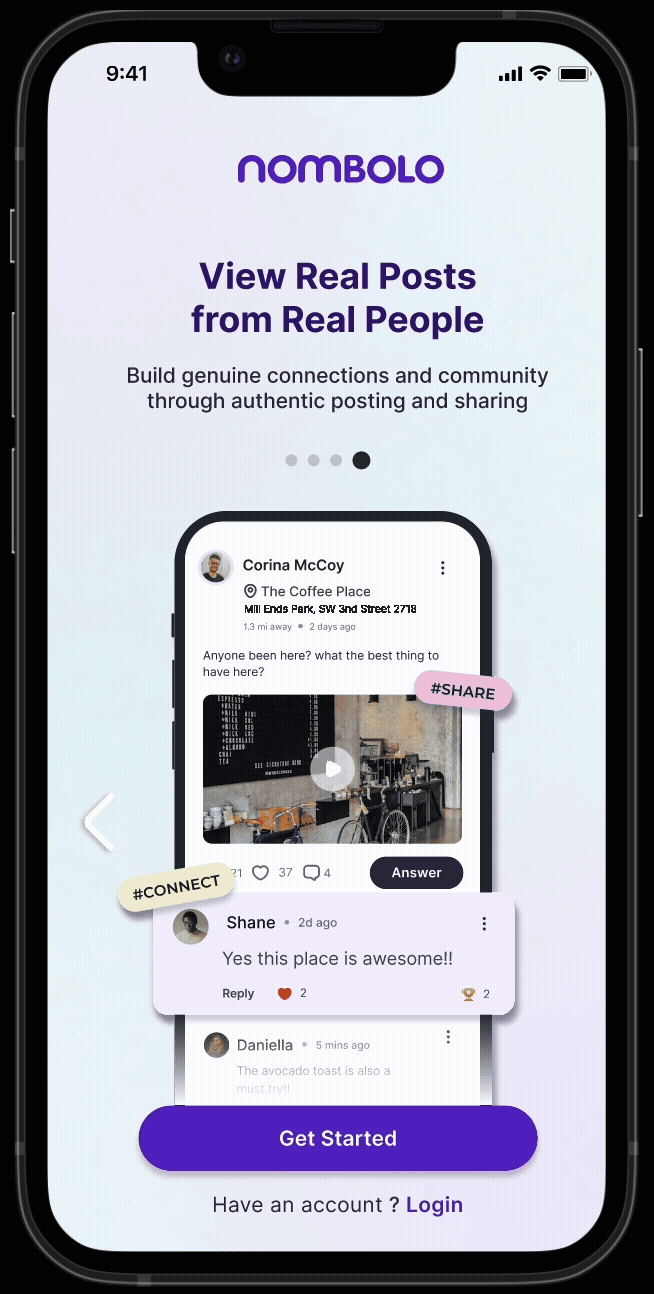
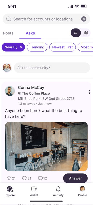
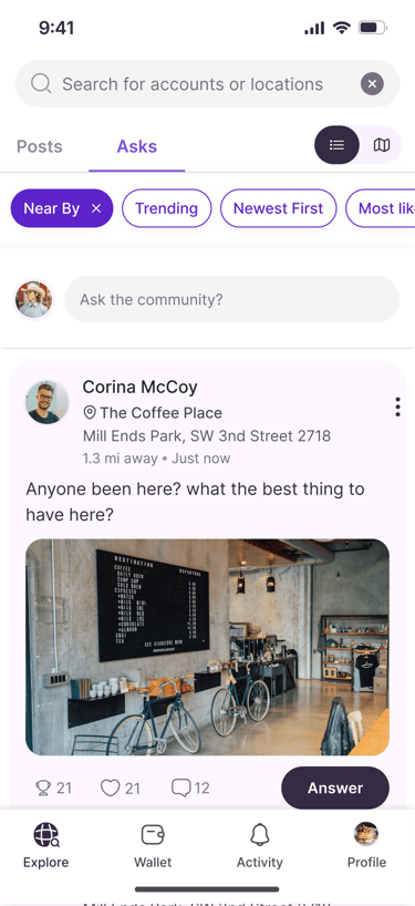
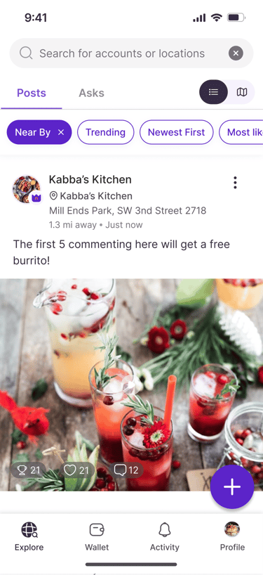
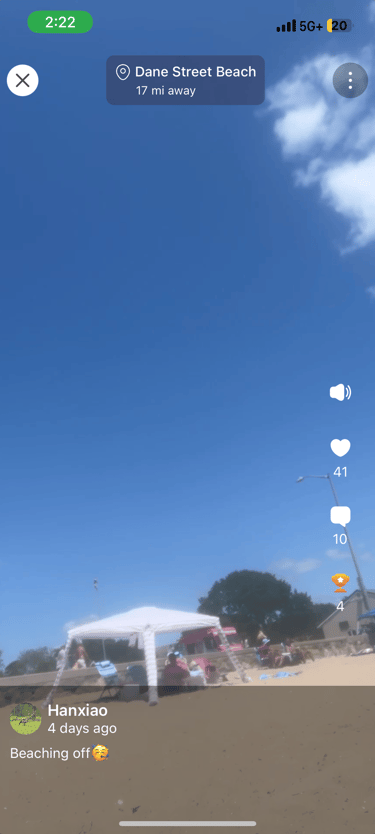
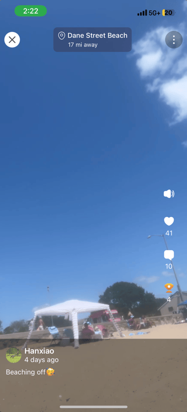
2. FEED THAT READS AS INTERACTIVE


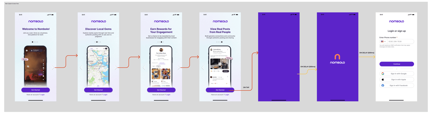
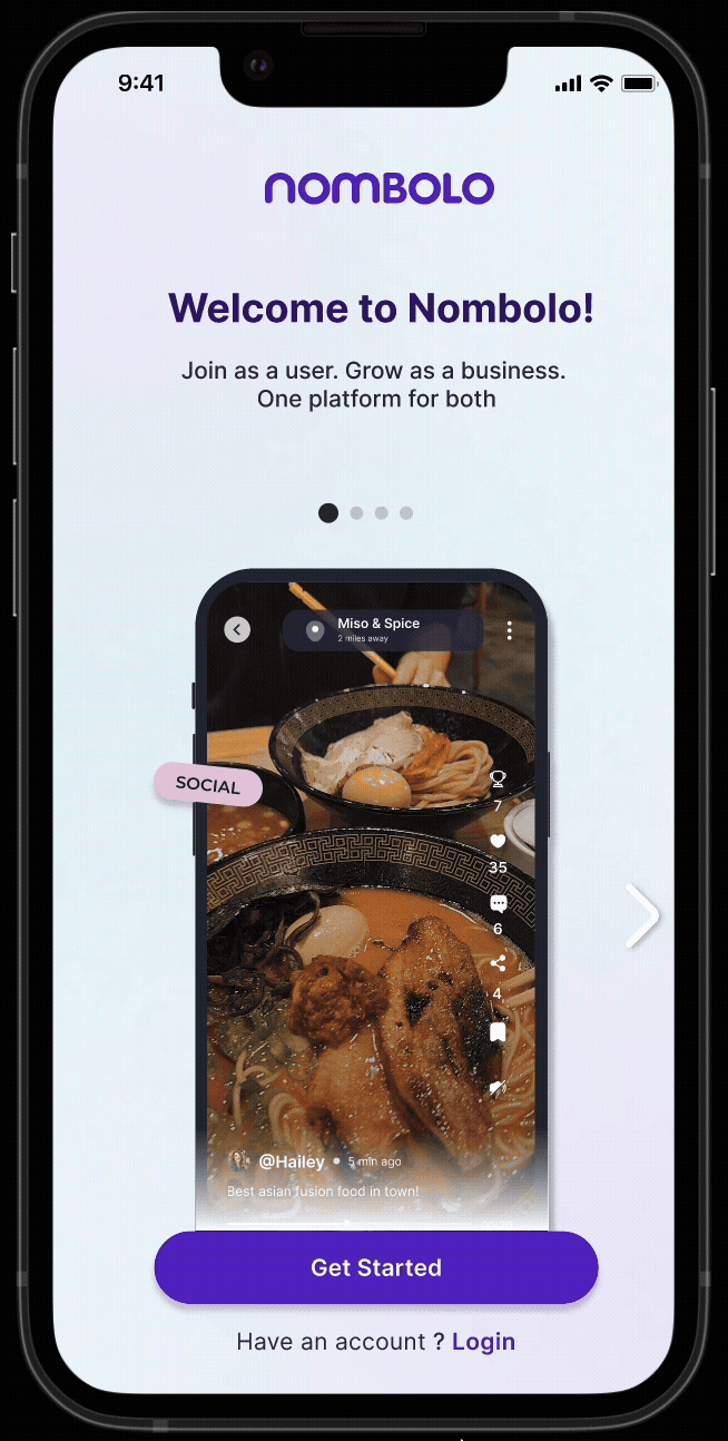
Onboarding flow
Explorations of Feed view screens
Reevaluating User flows for Create Post feature
To keep momentum, I added progress + skip and multi-modal navigation (swipe, arrows, CTA on every screen). It’s quick if you want it, skimmable if you don’t.
Dev handoff: I wrote a motion spec (durations, easing, transition rules, edge cases) so the React Native build matched the prototype. No guesswork.
Result → Onboarding completion rate increased in tests, and new users understood core actions without explanation.
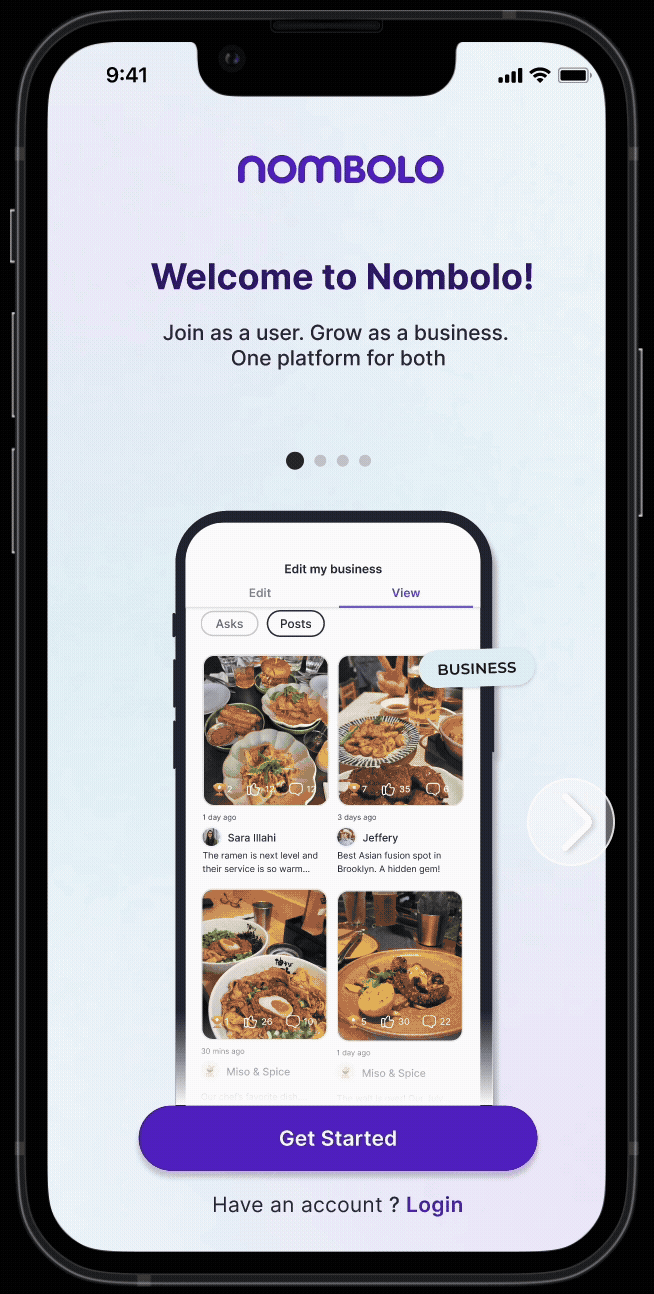
"Join as a user. Grow as a business. One platform for both.”
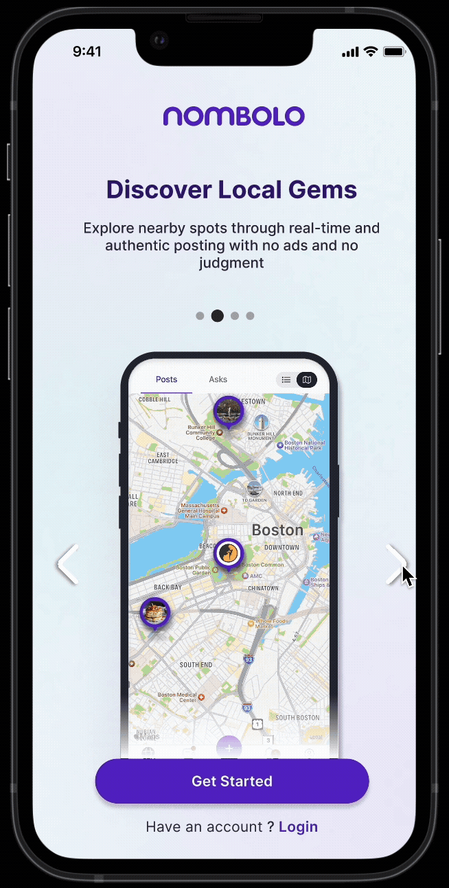
1. ONBOARDING THAT EXPLAINS ITSELF
Illustrations were cute, but people still asked, “So… what is this?”
I replaced static illustrations with short motion sequences that showed Nombolo’s three core actions: Discover, Share & Earn Rewards. Each screen used lightweight animation and clear hierarchy to demonstrate behavior, not describe it.
I worked alongside the marketing interns to use appropriate language for the onboarding screens. We collaboratively came up with clean, honest copy.
Because the team operated like a startup lab, design was iterative and playful.
I explored multiple feed layouts, card styles, and motion behaviors in Figma, from minimal clean grids to vibrant, kinetic compositions.
Preserve better aspect ratios
Clear play affordance and tighter hierarchy so your eye lands where it should.
A bit of personality in micro-interactions, without slowing the scroll
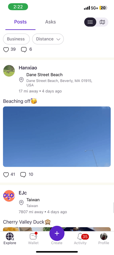
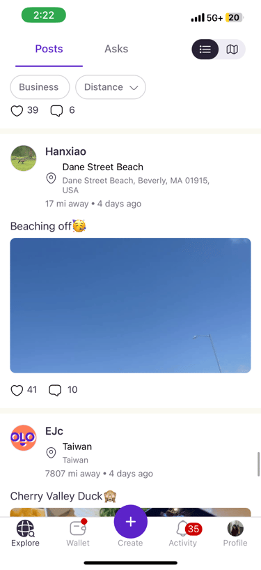
Example of the feed with a post of a beach video. The thumbnail was so tightly cropped that the ocean wasn’t even visible.
This moment captured the problem perfectly: videos weren’t being recognized as videos.
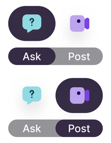
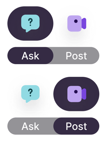
Refining graphic assets for Create feature
Previous Create icon design
Impact & Takeaways
Task: Simplified onboarding
Goal → faster comprehension, higher retention.
Task: New feed hierarchy
Goal → stronger engagement with video content
Task: Separated creation flows
Goal → fewer errors and smoother posting experience.
Designing for early-stage startups means balancing clarity with experimentation. You’re building structure while the ground is still shifting, which is exactly where creativity thrives. Every design decision, from an animation curve to a button label, became a chance to define what this product felt like. And in that process, I learned to advocate not just for usability, but for vibe — how design can make something feel genuine, local, and alive.