Whoop+ fitness smartwatch
Wearable Interface Design Case Study
MY ROLE
UX Researcher & Designer
User Research, Interaction, Visual Design, Prototyping & Testing
OVERVIEW
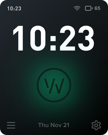
Whoop+ is a conceptual extension of the existing WHOOP ecosystem. A smartwatch interface that.reimagines how fitness tracking and recovery insights can be experienced on the wrist. It blends WHOOP’s powerful health analytics with intuitive and glanceable interaction designed for users on the move.
Created for fitness enthusiasts and individuals who prioritize health and recovery, this concept explores how the WHOOP app’s data-rich experience could evolve into a seamless interface for the wrist-based companion.
TEAM
4-person group
This project was completed as part of my Computer Interface Design class at the Tufts Human Factors Engineering Department
TIMELINE
Oct - Dec 2024
The Challenge
How might we design a wearable interface that keeps Whoop’s advanced data accessible and actionable without overwhelming the user?
Whoop already provides powerful insights through its mobile app, but its users wanted on-the-go feedback without diving into their phones. Our challenge was to design a wearable interface that offered instant, meaningful updates while staying true to Whoop’s minimalist brand.


“How can a smartwatch surface complex data in a way that feels effortless, not analytical?”
Research & Discovery
Demographic Insights: Target users aged 20s–30s, primarily using smartwatches for fitness tracking, health monitoring, and timekeeping.
Survey Focus: Assessed smartwatch ownership, liked/disliked features, and usage patterns.
Key User Needs:
Accurate tracking of health and fitness metrics
Personalized insights aligned with individual goals
Simple, intuitive navigation
Long battery life
Pain Points Identified:
Overly complex interfaces
Cluttered UI
Inconsistent or inaccurate health data
We began by interviewing fitness enthusiasts and Whoop users. Most described two recurring pain points:
“Too many numbers, not enough meaning.”
1. Overload
2. Inconsistency
“My fitness tracker tells me everything after the workout, not during.”
INTERVIEWS & SURVEYS
We mapped these insights into key user needs:
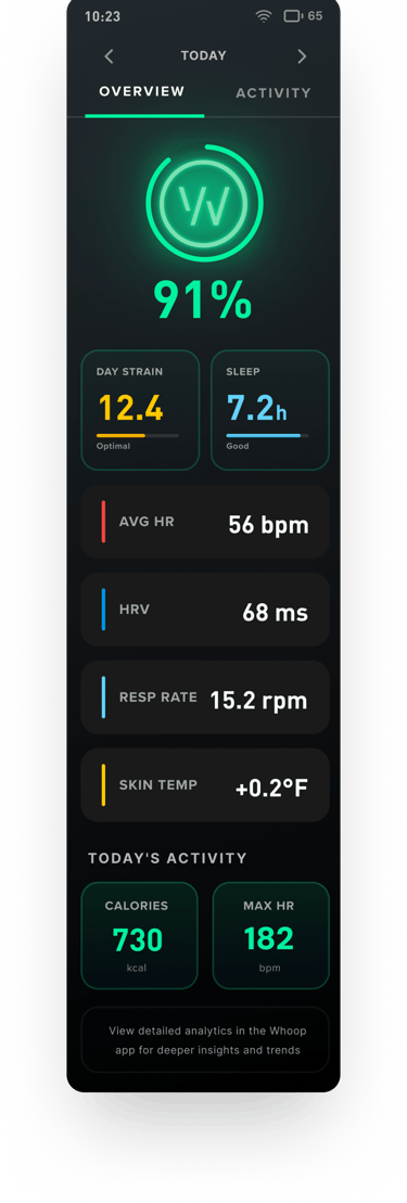
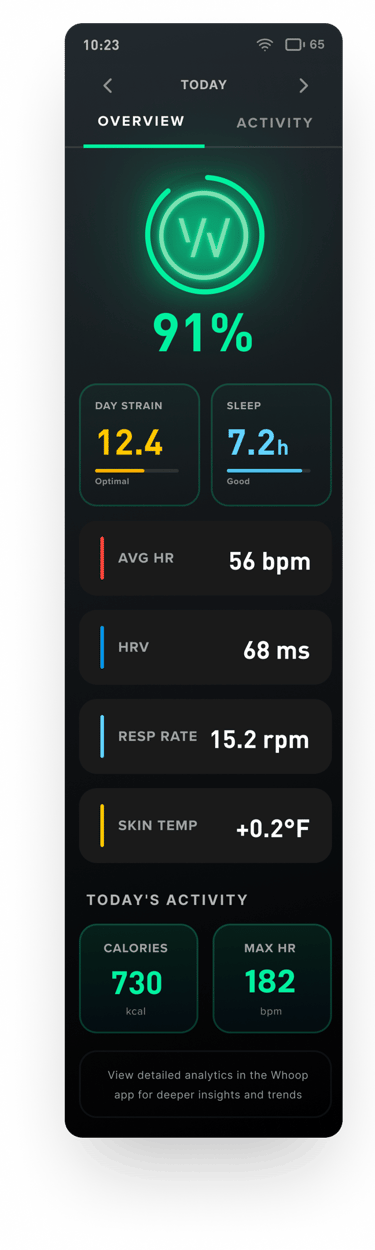
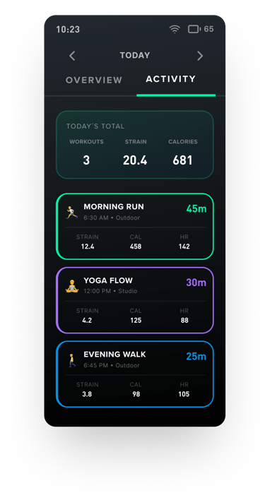
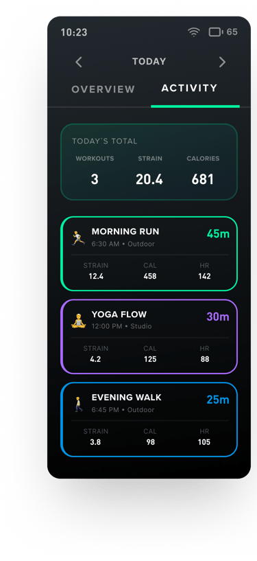
Access to core metrics (strain, recovery, sleep) directly on the wrist
Simple navigation that works mid-movement
Quick Actions - Countdown timer and simplified alarm settings
Feedback that motivates rather than overwhelms
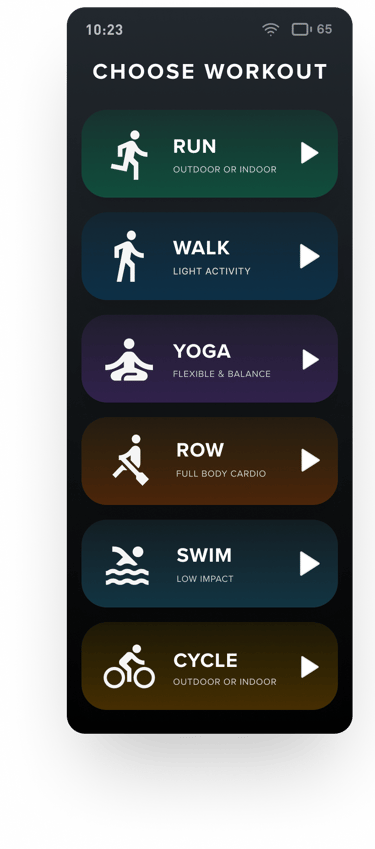
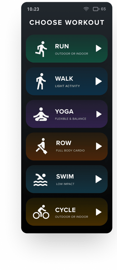
Added expanded workout options - stretching, yoga, and meditation tracking
IDENTIFYING KEY FEATURES
RESEARCH METHODS
User Interviews (fitness enthusiasts & Whoop users)
Competitive Analysis (Apple Watch, Garmin, Fitbit)
Surveys on wearable pain points
Task Analysis
Ideation & Concept Development
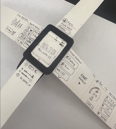
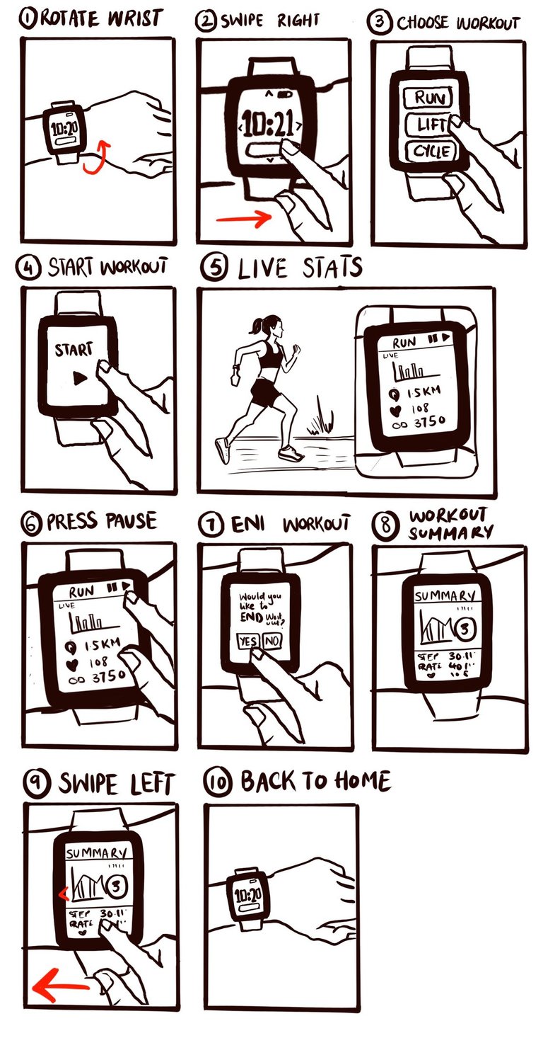
STORYBOARDING THE WORKFLOW
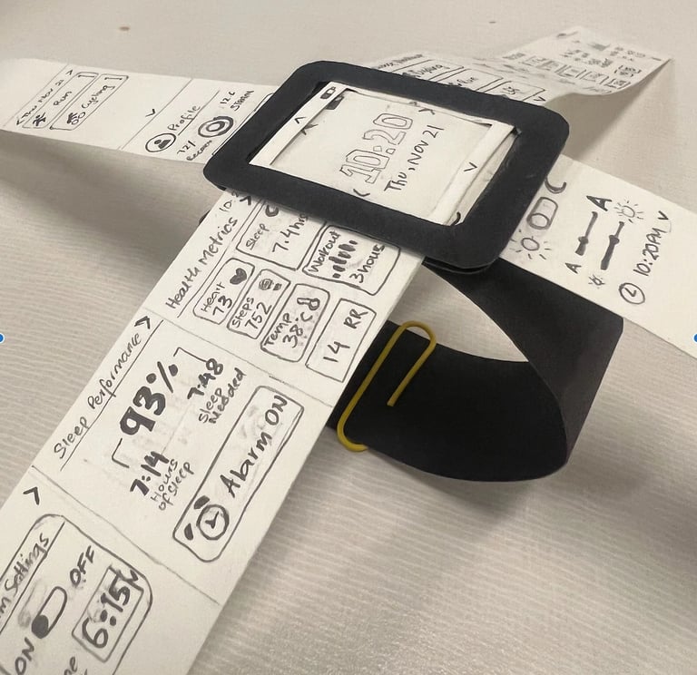
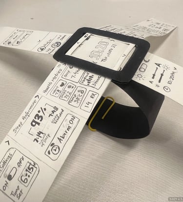
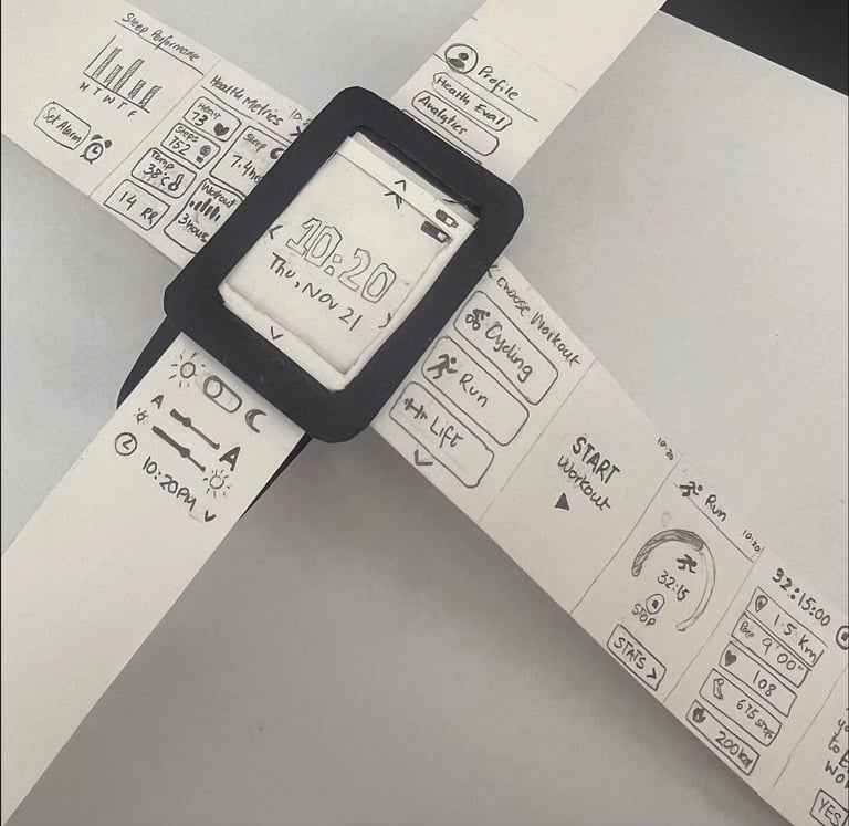
PAPER PROTOTYPE
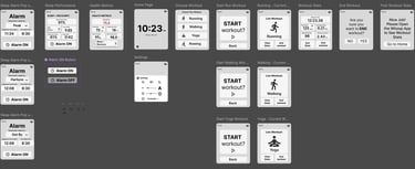
Wireframing & Early Testing
USER TESTING RESULTS
Add a back button + swipe gesture for dual navigation
Make workout icons visible from the home screen
Simplify alarm and sleep recovery settings
Our first digital prototype went through three usability test rounds.
Users loved the clean visuals but struggled with navigation depth. Their feedback led us to

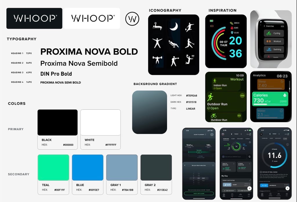
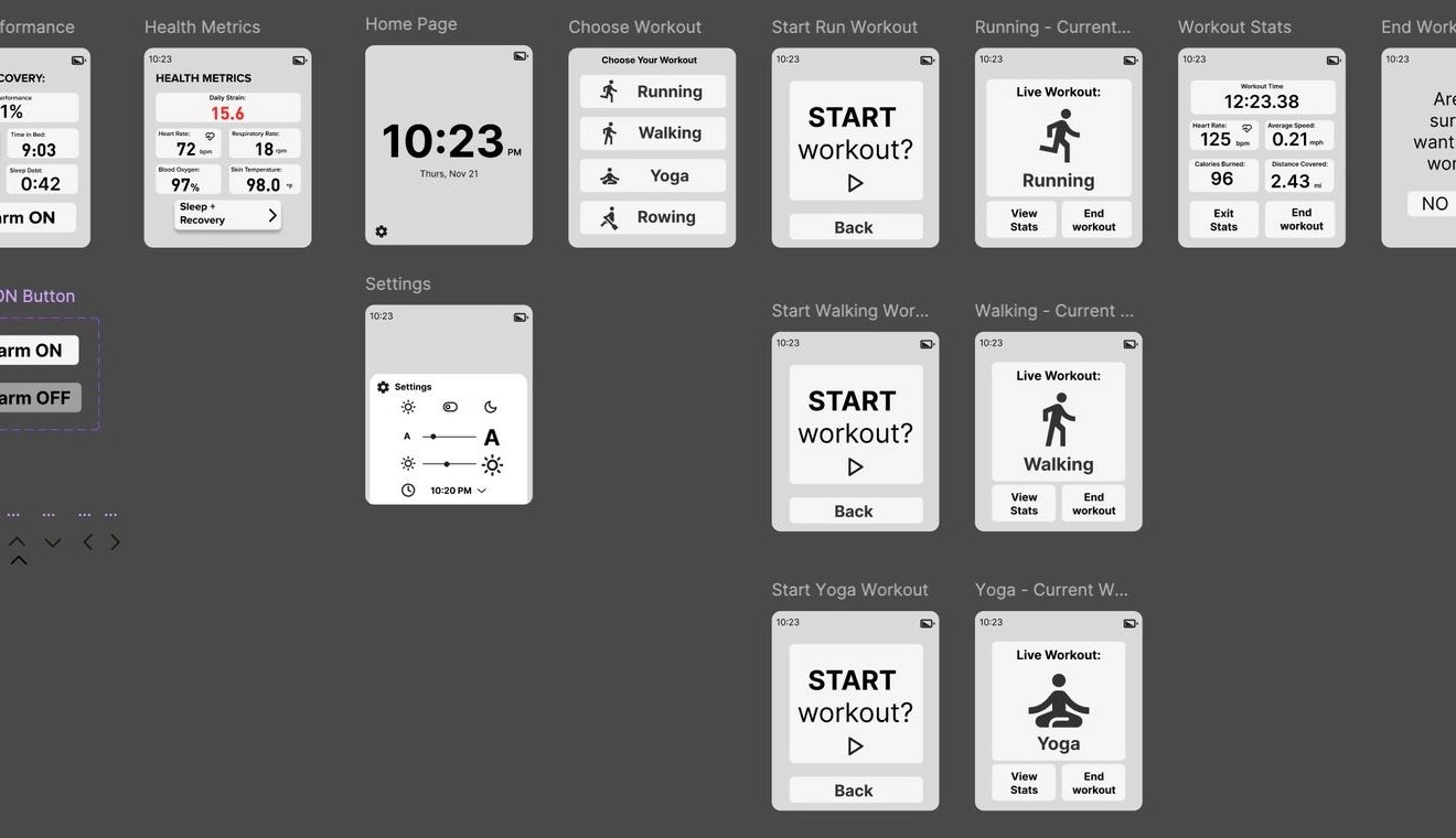
Visual Design System


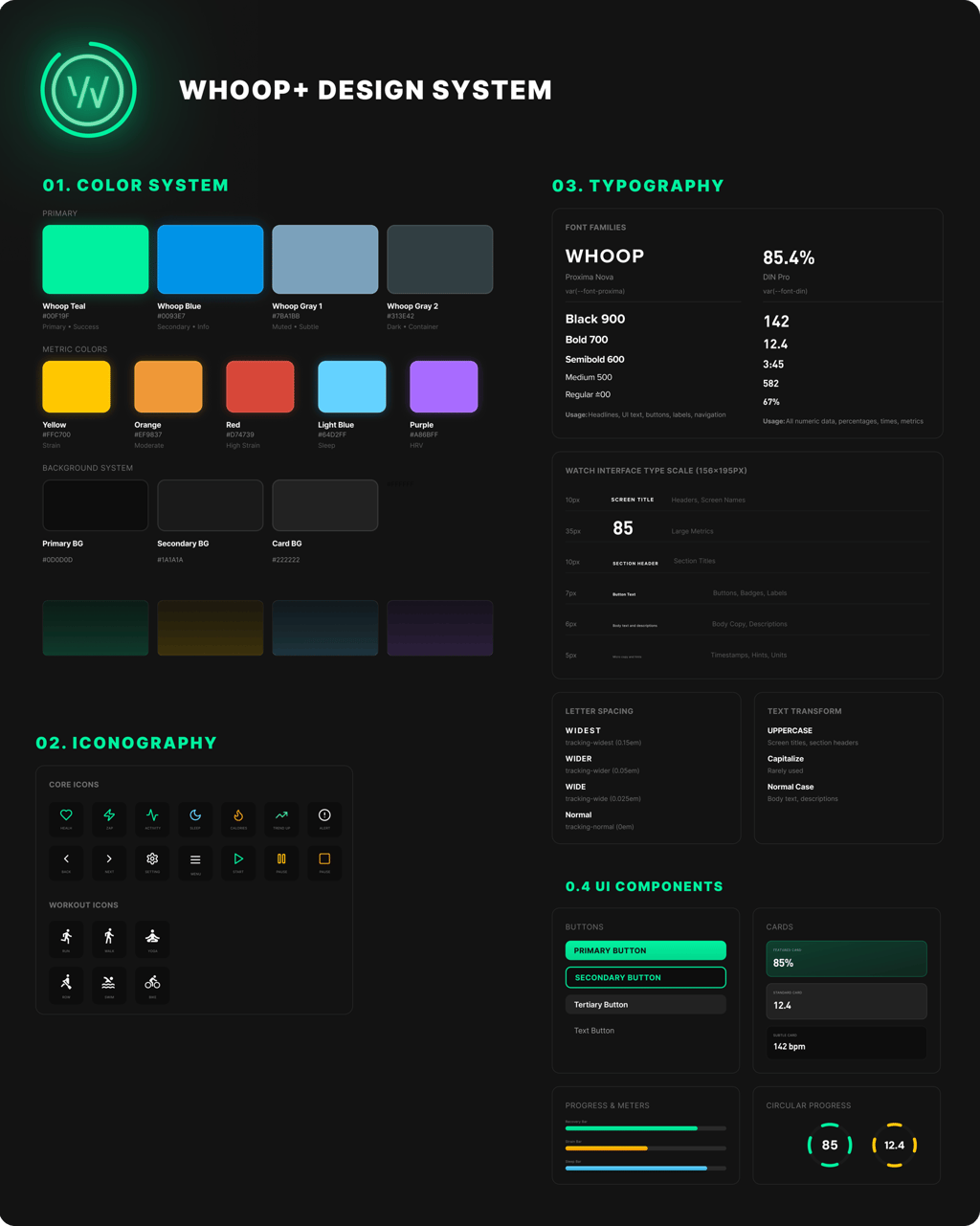

Iterative Design: Applying the Design System


Iterative Design: Addressing User Feedback
Usability issues in early rounds revealed that the navigation structure was the primary pain point. Users hesitated, over-tapped, or got lost mid-task, especially during workouts when cognitive load is naturally higher.
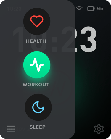
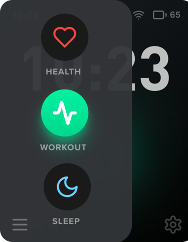
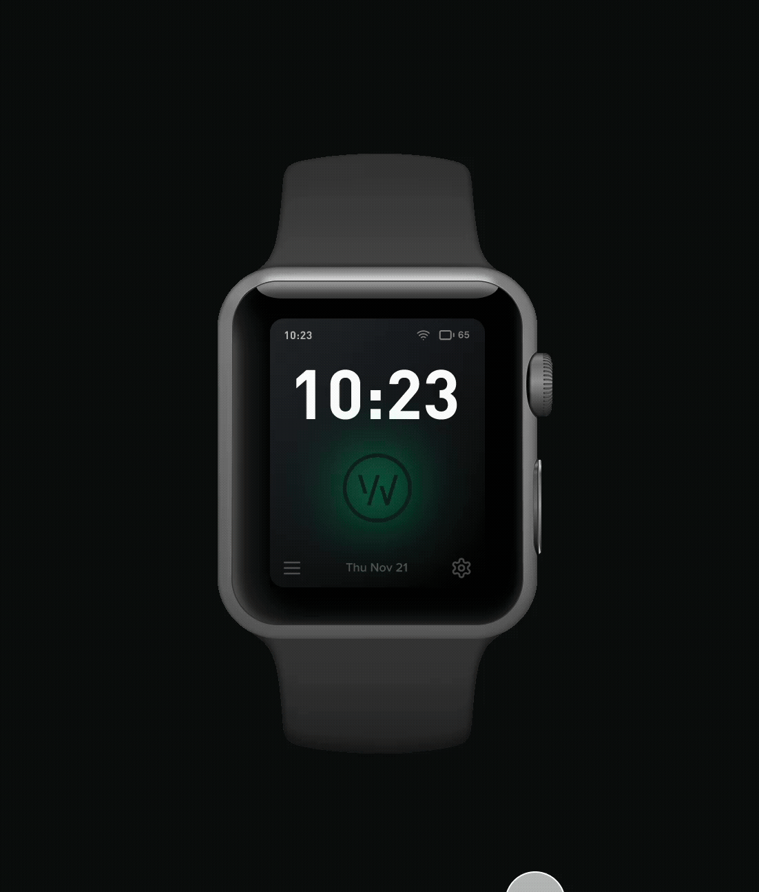
To address this, we built a dual-navigation model, inspired by our paper prototype, centered around the home screen, ensuring every core function was only one intuitive gesture away
Swipe Left > Workout options (start, pause, stop, view live stats)
Swipe Right > Health metrics (sleep, recovery, strain) + alarms
Swipe Up > Settings (brightness, text size, time display)
Swipe Down > Profile & workout history
Throughout the Whoop+ project, our iterative design process focused on three guiding principles:
brand alignment, intuitive navigation . visual consistency
Early prototypes exposed issues such as inconsistent aesthetics, overwhelming settings and unclear navigation patterns. Each round of iteration brought the design closer to a system that reflected the clarity and restraint of Whoop’s brand while supporting seamless user movement.
We tested the final Whoop+ prototype with 5 participants using a think-aloud protocol. Each participant completed a series of core tasks:
Start and finish a workout
View workout and recovery stats
Adjust settings (brightness, text size, time format)
Set and turn off an alarm
Participants were instructed:
“Use this watch as if it were your own. Start a workout, check your stats, adjust settings, and set an alarm.”
After completing the tasks, we asked:
What did you like most?
What felt confusing or frustrating?
What were you expecting to see that didn’t appear?
How would you improve navigation?
Our results displayed positives outcomes, Users completed all tasks with minimal friction. From the Qualitative data collected, users described navigation as “simple,” “predictable,” and “easy to learn."
30% faster task completion and noticeably smoother interaction flow
What Stood Out:
This design decision for dual-navigation proved critical: By anchoring the interface around a simple spatial gesture system, users completed tasks faster and expressed higher confidence navigating the interface,.
This proved to be ideal for a smartwatch where micro-interactions matter.
DUAL-NAVIGATION MODEL
This led us to rethink the architecture entirely. Home sits at the center, anchoring every action. Why this works:
Users always know where they are
Each function is exactly one gesture away
Swipes match natural mental models (left = go, right = review)
The Menu button for navigating to pages was also kept an option for easier access.
User Testing & Results
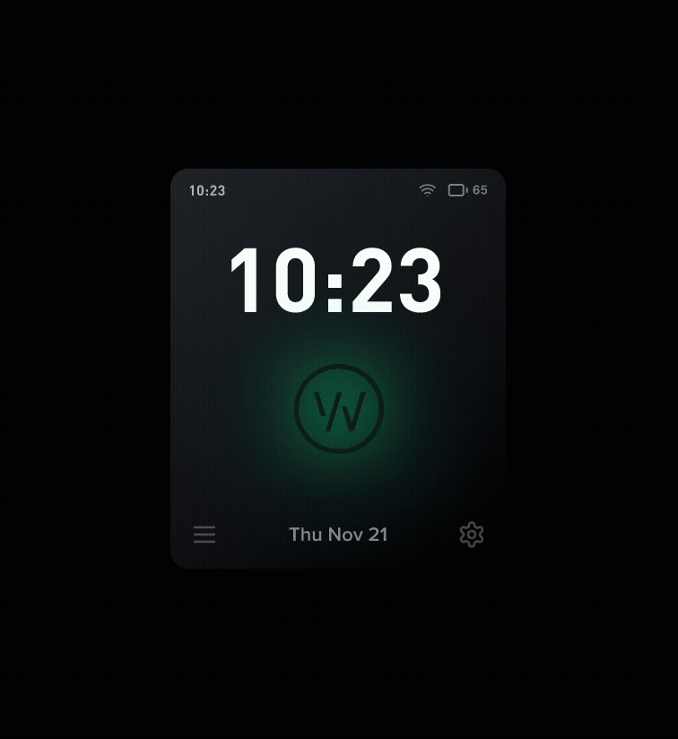
Final Whoop+ Watch Prototype
This Iterative design process taught me that designing for wearables requires extreme clarity. With such limited screen real estate, every gesture, label, and transition must carry intention. The dual-navigation model became a breakthrough, transforming early confusion into a fluid, user-centered experience. Ultimately, the design into alignment with Whoop’s brand DNA while improving real-world usability in measurable ways.